INTRODUCTION & GOALS
The original goal of this project was to redesign an existing site for the radio show called "This American Life". The redesign was supposed to demonstrate the ability to organize a large amount of content in a way that promoted usability. CSS was to be used for positioning.
The original logo and all photographic and sponsor images had to be kept for the redesign, but aside from that, new graphics were to be created that were attractive and that added appeal to the overall look and feel of the site.
ORGANIZATION OF MATERIALS
A main challenge of the redesign was to organize a fairly large amount of existing material in a new way that would enhance usability. Unfortunately, the original site that this project was based on has since been redesigned so it's not possible to provide an exact discussion of "before and after". However, I do know that the search box on the original site tended to get lost so a decision was made to make search fairly prominent, both in terms of size and location on the page. Similarly, the mailing list sign-up was added to each page, directly under search.
Pages
Terms used for the main sections of the site were also modified. Some terms were shortened, others were rewritten to use terms that might be more familiar and still others were modified to be friendlier or to produce a call to action. New and old terms for the sections of the site are as follows. Global nav items have checks beside them and their subnav items appear beneath:
| Redesigned Page | Original Page |
| Home | Home |
| About Us | Never Heard of Us? |
| Our Staff | Staff |
| Press Clips | Press Clips |
| Listen | Where to Listen |
| Archives | Complete Archive |
| Contact Us | Contact Us |
| Submit a Story | Submitting Work |
| Internships | Internships |
| FAQ | FAQ |
| Educators | For Educators |
Navigation & Status Indicators
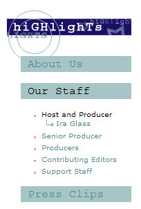
For ease in navigation and helping the user know where they are, the left nav changes to reflect current position in the site as well as any subpages. For example, in the graphic below, you can see that we're in the "Our Staff" subsection of "About Us" and that "Press Clips" is another subsection under "About Us". Also, we can see that there are several subsections in "Our Staff". Currently, we're on the page that features Host and Producer, Ira Glass but if we wanted, we could navigate to the pages for Senior Producer, Producers, etc. On especially long pages, pull quotes appear in this area of the left nav, enabling people to navigate to specific portions of the page that might interest them.
Another type of navigation aid can be seen in the main headers. For example, in the graphic below for the page "Press Clips", since Press Clips is a subsection of the About Us section, the words "About Us", followed by two angle brackets (> >), appear over the main header of "Press Clips" similar to how breadcrumbs might be done.

GRAPHICS
Since a pre-requisite of the redesign was to maintain the existing logo, colors and themes for the site were derived from that:
Original logo:
![]()
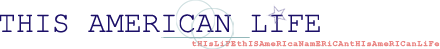
The logo has a look of 2 concentric circles — the circle created by the globe and the larger half circle around the globe. The concentric circle theme can be seen in some of the newly designed graphics. Since the name of the show is 'This American Life', and since the logo has — in addition to the green color — muted red, white and blue tones, it was decided to capitalize on Americana symbols, such as stars, flags, etc. I listened to several of the radio shows before completing my ideas for the design and was struck by the delightful "quirky" flavor of the show. I decided on a design that used randomly capitalized letters all run together in a whimsical fashion to complete the design concept. Some examples of graphics illustrating these features can be seen below:
A left nav showing the use of concentric circles, stars and funky text:

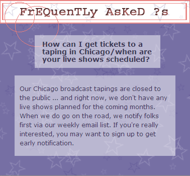
A popup window from the FAQ page with a flag look (note that the concentric circles have 'slipped' a bit):
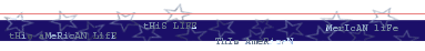
The footer — flag motive, funky text and stars:
A main header ('slipped' circles, stars, funky text):

The search box (concentric circles, stars, funky text):
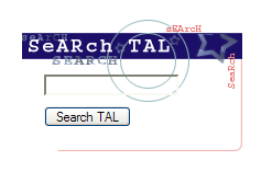
The search box is of special interest in that the image shows through the input box. It took several attempts to get this to work. The original problem was that I could absolutely position my form on top my background image but it made the form not work. I could make a separate image just for the part that would appear in the input box and style the input tag to have a background image. That would work except it's wonky because it means that all possible browsers and platforms have to render your positioning exactly the same or the images won't match up. The final thing that worked like a charm is to use a 1px transparent gif as a background image for the input box. The underlying background image shows through and the input boxes work in most browsers. Some Mac browsers won't display the background image, but in all cases, the form still works.
JAVASCRIPT
The javascript for the global nav rollovers is called the HV Menu- by Ger Versluis. It's a nice rollover script with a lot of flexibility and is easy to use. However, since the entire navigation system is JavaScript, a concern was that it would prevent search engines from spidering the site and that it would also prevent users who have JavaScript disabled from being able to use the site. To address these concerns, a <noscript> element was added that presents all pages in both the global and sub navs as plain links.
This is the code to call the JavaScript navigation:
<script type='text/javascript'>function Go(){return}</script>
And this is how it looks (subnav menu items appear on rollover):

This is the code for the noscript tags:
<noscript>
<div id="noscriptNavWrap">
	<ul class="noscriptNav">
		<li><a href="home.html" class="mainsection">Home</a></li>
	</ul>
	<ul class="noscriptNav">
		<li><a href="about.html" class="mainsection">About Us</a></li>
			<li><a href="staff1.html" class="subsection">Our Staff</a></li>
			<li><a href="press1.html" class="subsection">Press Clips</a></li>
	</ul>
	<ul class="noscriptNav">
		<li><a href="listen.html" class="mainsection">Listen</a></li>
			<li><a href="archivemain.html" class="subsection">Archives</a></li>
	</ul>
	<ul class="noscriptNav">
		<li><a href="contact.html" class="mainsection">Contact Us</a></li>
			<li><a href="faqsubmissions1.html" class="subsection">Submit a Story</a></li>
			<li><a href="internships1.html" class="subsection">Internships</a></li>
	</ul>
	<ul class="noscriptNav">
		<li><a href="faq.html" class="mainsection">FAQ</a></li>
	</ul>
	<ul class="noscriptNav">
		<li><a href="educators1.html" class="mainsection">Educators</a></li>
	</ul>
</div>
</noscript>
This is how it looks on a page:
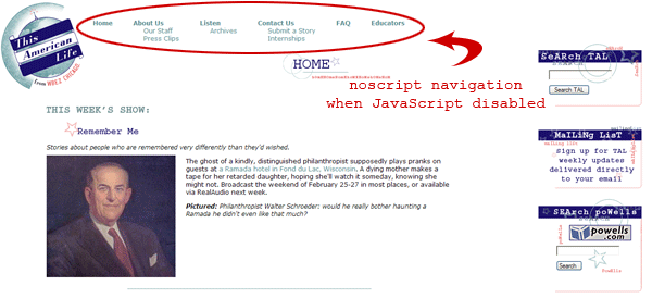
A close-up view of the noscript navigation:

Another JavaScript issue concerns the popup windows in the FAQ section. Originally, they were coded like this, which again, is going to fail for users who have JavaScript disabled and also for search engines:
Original Code:
<a href="javascript:newWinSm('faq/top1.html');">How can I get tickets to a taping in Chicago/when are your live shows scheduled?</a>
To solve these issues, the code for the popup windows was rewritten with Unobtrusive Javascript:
<a href="faq/top1.html" onclick="newWinSm('faq/top1.html'); return false;">How can I get tickets to a taping in Chicago/when are your live shows scheduled?</a>
FINISHED PRODUCT
The live site can be viewed here.