A brief discussion of the creation of the graphics on the
CSS Zen Garden Frog Pond.
A question I get often when people first see this site is, "How'd you do the graphics?" Unfortunately, I did not keep notes and since it's been a couple of years since I did them I won't be able to tell you exactly.
However, I can give you a general idea and show you some visuals. I started with photographs. For example, the frog began life in the pond like this:
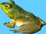
After removing the background, I know I used a series of Photoshop filters — probably Brush Strokes > Ink Outlines, possibly added some Noise, and then I'm sure some other stuff. I tend to be a trial and error kind of designer and will work and rework a piece hundreds of times before I come up with something I can settle on, so basically at this point, just start playing. The examples below are different froggy iterations, with the 2nd and 3rd ones actually used on the site.
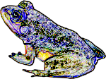
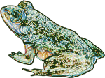
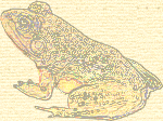
The waterlilies underwent a more dramatic transformation. I started again, with just a photograph of waterlilies which became the more abstract looking graphic on the right:
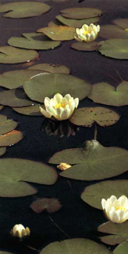
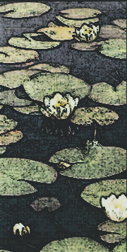
Basically, at this point, I cut out individual waterlilies and flowers and arranged them into various compositions, depending on what the overall look and feel of the site seemed to need. It was important that the whole site gave the appearance of "flowing" down the page. This effect was accomplished by trailing the waterlily arrangements from one side or the other and also by different left and right margins for the blocks of text. The graphic below is an example of one of these arrangements:
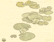
By far the most challenging part was putting all of the individual graphic elements together to make one, flowing composition. The irregularities in the linen-look background was a special challenge in that care had to be taken to make sure that join lines for repeating components would be seemless and that the blotchy look would maintain a random feel, instead of being an obvious repetition.
I found one iteration of the top graphic that I had saved, which will allow us to get an idea of the process. (I've sized it down so it will fit on the page better and also put a 1px green border around it so you'll be able to see the boundaries of the graphic.)
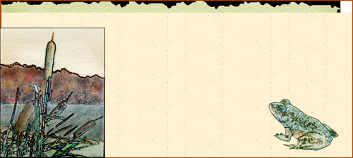
There are several things of interest here.
- First, notice that originally, I had the grain of the linen running vertically. Somewhere along the way, I realized that it looked much better running in a horizontal orientation.
- Also notice that I made the linen in a rectangular sheet and then created the edges separately. This was so I could keep the top, bottom, left side and right side edges as separate pieces, which helped with matching elements that repeated. To create the edges, I used the lasso tool to select an irregular, jagged border and then deleted the selected area. The background layer for the linen was black, so in areas where the linen was deleted, the black shone through. This was done so the whole thing would blend in with the black background color of the site. To soften the edges and also make the "torn paper" look more realistic, I used the smudge tool set at 1px and pulled out little threads at random, close intervals along the whole length of the edge. This process was tedious and probably took an hour or more just for that one effect.
- The cattail graphic also began life as a photo and was treated similarly to the frog. Once I had these two components in place, I got rid of the border on the cattail graphic and began creating the mountain and water background scenary. I don't remember everything I did to create these effects, but I know they were done by hand. Paint brush, clone tool, various filters and blending modes, etc. When I had things more or less the way I wanted them, I used a sharpen filter on the water to make it "sparkle" a bit. The burn tool as well as some brush effects helped add the "old" look to the parchment. Individual water lilies were cut out and added under and around the frog to give him a place to sit.
I must say that this was an extremely fun and fulfiling project to work on. I spent literally hundreds of hours on both the graphics and the CSS and loved every moment of it. Hope you've enjoyed this brief behind the scenes tour.

