
docTypes© is an online application by  Shrink-Art.com
This document is a visual history of the prototypes for "docTypes" which is an online application to help mental health practitioners with practice management tasks. Each screenshot is of the Clients page of the application, which holds demographic information on clients that have been entered into the database. All client information is fictitious.
First Prototype
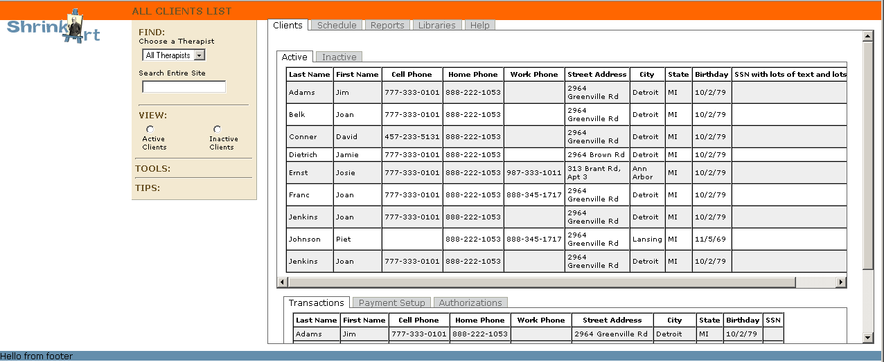
The original plan was to have two sets of subnavigation tabs nested within a larger set of global nav tabs. This prototype shows an "Active/Inactive" set of subnav tabs above the "Transactions/Payment Setup/Authorizations" subnav tabset, both appearing on the page activated by the global nav "Clients" tab. Positioning of the main page elements has only just begun. The header (orange) and footer (blue) are in place but the logo and left nav are just sort of hanging there. (Background colors were only to aid with the coding.)
Note: Most screenshots have horizontal scrollbars. Actual scrollbars can be difficult to differentiate between the scrollbars that are present in the screenshots.
And the Two Became One
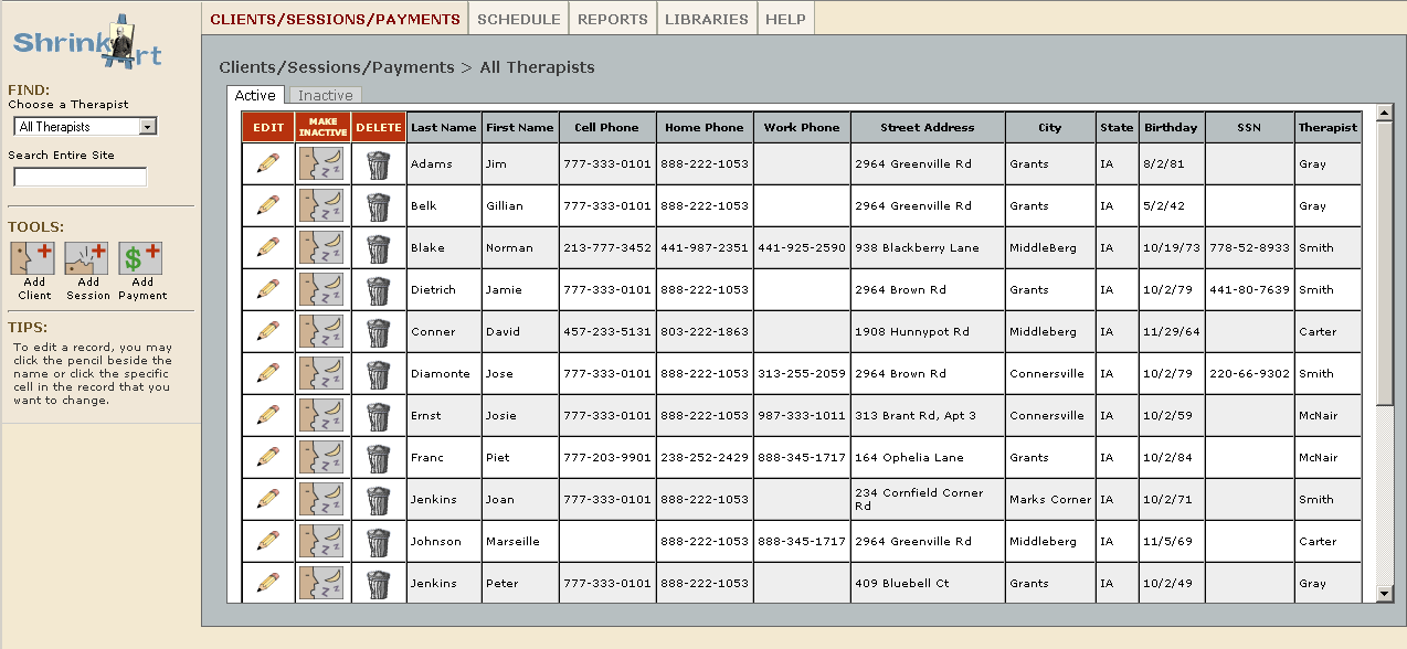
Although the double nested tabsets worked fine technically, it quickly became apparent that it would be a nightmare to figure out conceptually and also that pages could end up being overly long. The solution was to have only one nested tabset and to access the other components (transactions, payments, etc.) as tools on the individual client pages. The global nav tabset has been given a different look and feel from the nested tabs. Icons have been added as are functionalities of Edit, Make Inactive or Active, and Delete.
Hide Those Tools!
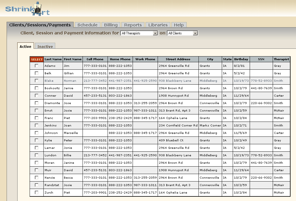
It became obvious that with all the data you could conceivably have and want to display in the client table, the pages could end up with a considerable amount of horizontal scrolling, which would make them difficult to use. To solve this, the left nav was done away with as were the Edit, Make Active/Inactive and Delete tools that the previous version had. Select boxes were added as another way to access information. Logo was moved above all of the data tables and gradients were explored as design elements. Global nav was redone again so it resembles the nested tabset. Can't remember why I did this. May change it back to the previous look at some point.
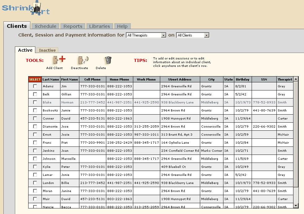
Ah . . . HERE Are My Tools
Tools and Tips are now positioned across the top of the nested tabset. The gradient idea is toned way down (can be seen on the top of the Clients tab). Still no good home for the logo which just sort of sits there at the top of the page.
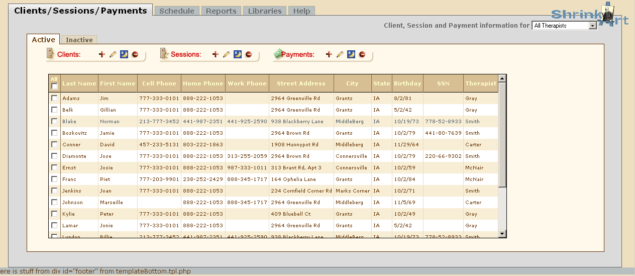
Tools & Icons Galore
A much fuller set of tools and icons now appears across the top of the page. Logo has been moved to the upper right. Nested tabset has a new set of colors. The "Clients" tab has been changed to read "Clients/Sessions/Payments" for better usability. Tips have disappeared and frankly, I can't remember why. I think the whole thing was feeling a bit overwhelming at this point.
Rethinking Functionality
The idea of presenting a complete set of tools on each page was ditched in favor of only presenting the tools that particular page would need. Each page of the site was examined, asking the question, "What are the things I would need to be able to do from this page?" With fewer tools, it was now possible to bring the tips back in. A version very similar to the screenshot below was used for usability testing.
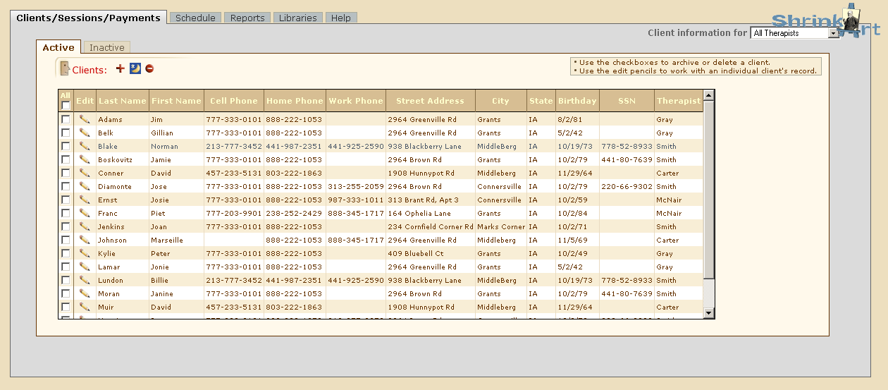
Post-Usability Study: The Tools Move Yet Again.
Users had difficulty with the notion of clicking a checkbox and then having to locate the tool they needed. The consensus by all testers was that they would prefer to have the tools by each client's name. Some testers also said they would prefer words instead of or in addition to icons. The version below reflects those changes.
